Monday, 25 April 2011

Evaluation

Q1) In what ways does your media product use, develop or challenge forms and conventions of real media products?

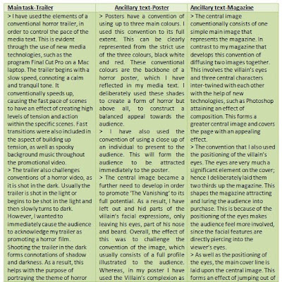
The main media product is split into three media texts, the trailer, poster and magazine. Within the trailer, consists of elements of challenging the conventions of a horror trailer and will form specific tones in different scenes. The poster is the strongest media text that needs a strong central image, since it is one the main conventions. This made it the prime element to develop or challenge. Similarly, the central image also plays a significant role on a front cover, especially when promoting a film. Ultimately, when using, developing and challenging forms and conventions of the real media products, new technologies were the main culprits in helping me to achieve a unique and professional feel of the media texts.


Q2) How effective is the combination of your main product and ancillary texts?


From analysing my main product, the poster and the front cover of my magazine all show a clear and strong link between them. This can be visually shown from the features shown in all three texts sharing an identical theme, which also shows signs of verisimilitude. This is evident in the trailer where a hooded figure is shown to be the cause of havoc, which links with the poster which shows some of the villain’s facial features, such as his eyes that are also situated on the magazine cover, hence enhancing the connection between the media texts. As a result, this helps the effectiveness of the combination to be maintained at a high degree towards making it simple to the targeted audience that all media texts are promoting the same film.

Although the trailer relates to both of the ancillary texts, it also relates with the viral campaign which consists of the strange unrevealed figure. However on further evaluation other than the trailer, the viral campaign also links to the other ancillary tasks, especially with the poster. A subtle but noticeable similarity shows the strong relationship between the texts, evidently shown through the tagline on the poster and the intertitle. Both are deliberately the same and read ‘running is futile’, which emphasises there is no hope and explores the aspects of the horror genre. The strong combination between these two media texts is further enhanced through the use of applying the same typeface and colour of the phrase. This ultimately creates an appeal, not only with the viral campaign and poster but with all media components that promote ‘The Vanishing’ towards the audience.


Q3) What have you learned from your audience feedback?


Q4) How did you use media technologies in the construction and research, planning and evaluation stages?


Tuesday, 19 April 2011

My Viral Campaign Video


My viral campaign video above was further altered in Final Cut Pro. In further detail, i have included the effect of a 'swipe' between the the hooded figure moving, when closest to the camera and then swipes away to show the intertitle, 'Running is futile'. I also extended the background music across the extended scene to not loose the spooky atmosphere and tp create an uneasy tone toward the audience. The hooded figure's face is never shown to add more focuss to create an engima.


However, on further and in depth evaluation, I have deliberatley left out the title of the film in which this viral campagin is promoting. This was the main idea to keep the level of mystery alive, expressing the conventional state of a viral campign. Also, my idea was to deliver the viral campaign six months to a year before the actual release of the film to the audience, giving the audience a lack of information and keeping the suspence at a high level. This will also have an effect becuase the date is the only element shown which provides the audience with that somthing 'big' and important that is going to be reveiled on that specifc date. Ultimately this will create a series of questions in the audience's mind showing true signs of cause and effect of a viral campign video.

Monday, 18 April 2011

Draft of My Viral Campaign


Here is my draft of my viral campaign video. Final Cut Pro has allowed me to construct and edit the viral footage, shot by myself which included the assistence of one of my group members.

Sunday, 17 April 2011

Viral Campaign Print Screens

Below are three print screens, showing the construction of my viral campaign video in three stages on the program Final Cut Pro.


Above is the first print screen, showing background of the viral video. The graphical representation of the edit below the image of the tree is shown as rows shows the layers of the tree and mist.


The second print screen above shows more layers below image containing the hooded figure appearing with an intense glow around him. This will enhamce the deliberate engimatic feel causing the audience to relate to an eerie atmosphere, which reflects the horror genre.


Above is the thrid print screen. This is showing the cloaked charcter moving closer towards the screen but in a differnt postion.

Saturday, 16 April 2011

Equipement

The equipment to help construct the viral campaign video are a:


1) SONY Carl Zeiss video recorder

2) Sherpa tripod

3) SONY Premium digital video cassette


All these types of equipment were also used for other purposes, such as the construction of the trailer. A digital camera was also required in order to take snap shots, such as for the photo shoot.


Along with these three main pieces of equipment and the digital camera were different programs that also helped me to create my media texts.

Programs, such as Paint, Microsoft Word, Internet explorer and Photoshop. These different computer programs were used in order to provide a high level of detail and accuracy, especially the Photoshop when dealing with central images.

Friday, 15 April 2011

Viral Campaign Research

Viral campaigning is a term that shapes meaning in using mystery to market movies. A great example of this is the film ‘Cloverfield’ has had a lot of attention when first appearing virally. This viral ad shows strong signs of expressing elements of being a viral campaign, as there is no title of film that is being promoted but only a release date, ‘in theaters 01.18.08’(American). This technique of providing the audience with a lack of information helps to develop the level of mystery, thus causing an enigmatic response throughout film viewers’ minds. The level of secrecy is one again carried out as a potent theme as the movie is not called ‘Cloverfield’ but presented as ‘codenamed: Cloverfield’, which explores viral marketing to its initial capacity.

Another piece of evidence of viral marketing is presented in the film ‘The Blair Witch Project’. This occurred in 1999, which was a film made by the production budget of $60, 000 and grossed $240,000,000 and overall was a movie defined viral marketing. A couple of years later Steven Spielberg explored more into going viral where he used web games to promote AI (Artificial Intelligence). This then followed 1million people visiting the film’s personal website. The website contains a series of clues and puzzles to solve that could ultimately lead to the teaser trailer or even something big and newly released to the fans that the fans themselves can cover. ‘The Dark Knight’ is another example of attaining a viral website. On closer inspection, the website shows the unveiling of who the joker is in stages where ‘Heath Ledger’ face does appear. However, this was only used once the full trailer was shown but nonetheless, the idea of this viral website does promote the film in a relatively high manner.

On the whole I think going viral is a great strategy and proves viral marketing works best for the sci-fi and horror genres, as fans for these genres are definitely more rabid.

Alternative advertising methods were needed if Cloverfield was going to attract the attention of the group of people who could be used to make this film a success in the cinema. A specialized online and computer-savy audience was specifically targeted as their interaction with the marketing was vital in the film generating interest from another valuable audience group, the mainstream movie-goer. The story of Cloverfield’s marketing shows how the online audience was used to create a buzz about the film to support a more traditional marketing campaign.

Link to Cloverfield viral video:
http://www.youtube.com/watch?v=IvNkGm8mxiM

Sunday, 10 April 2011

Personal Blog Entry

Today I have ventured out thoughts and ideas of creating a viral campaign. I have researched different viral campaign videos, such as 'The Dark Knight' and 'Cloverfield' to study the conventions and main features of the video. Therefore, I can look at challlenging and maintaining the conventions in my own viral campaign video.

I have also watched a programme on channel 4 called 'Rude Tube: viral ads'. This was an unusual experience as linking the humerous videos to promoting individuals and how they act on certain things. However, from this programme I have gained that society have produced videos acknowleging thier talents or the products which they have made. For instance, the idea of walking on water is a fantastic thought and dream but with advanced and new technolgies being made, a group of four men were promoting their product on 'Youtube' which is a huge media platform to promote your viral campaign.

Overall, I will create a viral campaign, promoting my film and putting it on my personal blog and on 'Youtube'.

Saturday, 9 April 2011

Final Magazine Cover


The image above is my final magazine. It consists of the masthead, reading 'Movie Mania' which shapes meaning appealing to the audience from the alliteration with the two 'M's. Also the word 'Movie' is written inside the word 'Mania', which adds a level of professionalism towards the product and the audience.

The media language is plays a significant part in attracting the audience. The button includes a freebie that reads 'Free CD' and 'this months biggest blockbuster'. Both of these phrases help seek the audiences' attention.

The main colours of the magazine is white, black and red. These colours are all forms and conventions of the horror genre. These colours were deliberately selected to design the magazine to create a stronger link between all the media texts, such as the poster and trailer, also including the viral campaign. Since, all these colours are situated in all media texts, this will cause an appealing perspective towards the audience and will benefit the process of promoting the film.

Friday, 8 April 2011

Magazine Prints Screens


This first print screen shows another initial image as opposed to the mock up. I had decided that to add to the level of professionalism, I made the link between the magazine and poster even easier towards the audience by using the same styled eyes.

Here I have added the central image, cover line and the masthead, all main conventions of the film magazine. I wanted to create the idea of the villain to be looking upon three individuals, connoting a tense and uneasy atmosphere.

Above is my third print screen of the construction of my film magazine. On closer inspection I have included a small background of leaves and trees to cover the white space. Skyline and a kicker line have also been added to lure in the audience.

Wednesday, 6 April 2011

Magazine Mock Ups


Above is my basic mock up of my film magazine. It involves my central image and the positioning of the cover line. In further detail, 'The Vanishing' is the film in which the magazine is promoting and is purposely laid three quarters down the page in order to become noticed and add an appealing feel towards the audience.


From this mock up, I have added a kicker, 'biggest movie of the year'. This media language, focusing on 'biggest' connotes a level of communication the audience, making the magazine stand out.
In addition, another sign of word play and media language is using a freebie. On closer inspection, presenting a button telling the target audience that their receiving something free. This will rekindle their thoughts on purchasing the magazine and will increase the chances of the product being sold.

Tuesday, 5 April 2011

Magazine Flatplans

Above is my first flatplan for my magazine. It consists of the main codes of the a film magazine, the masthead, the main image, cover line and the barcode. These were all my initial positions of where these specific elements were going to be positioned.

Here is my 2nd flatplan, showing a change in my thinking of creating some sort of text situated at the bottom of the magazine.

This flatplan introduces a skyline and a button, which also includes a barcode as well as the issue number. I deliberately added in these additional components to recall the codes and conventions of a film magazine.

Thursday, 3 March 2011

Colour Scheme

The colour scheme for my magazine will consist of the conventional number of three main colours. White and black will be another convention of the horror genre, defining the elements of good against evil and will therefore reflect the horror genre, relating to ‘The Vanishing’. These basic connotations will balance out the magazine, as these colours will cause other components presented on the front cover to stand out and sub consciously call out to the audience. This will be further enhanced with the third colour being a red, yellow or blue, mainly another colour that attains a bright and vibrant characteristic, which will personify the magazine with life, thus attracting the target audience.

Although these three conventional colours are highlighting the main features on the cover, such as the text including the masthead and slogans, other colours can be withdrawn by the audience from the central image. The central image will be three students, dressed in their normal clothes, such as colorful t-shirts and blue/black jeans. The image will also attain one character holding a blue bag over his shoulder, emphasising the theme of a journey and expressing elements of an adventure. This will provide a subtle and unknowing display of the magazine with movement within the three characters presented on the front cover, thus stretching the dynamic nature of the magazine.

Overall, my film magazine will consist of three main colours but will complement the colours of the clothing of the three individuals, mirroring an 18 year olds dress sense. In order for me to achieve this will look back at my colour wheel, labeled under colour scheme to identify what colours work well with each other.

Wednesday, 2 March 2011

Tuesday, 1 March 2011

Ideas : Buttons, Hooks and Teasers

Hooks, teasers and buttons are a variety of techniques that are required to draw the attention of the audience. Buttons are greatly used for this specific motive, since they are usually brightly coloured and have short statements or facts on what the magazine can offer the reader.
Examples of hooks, teasers and buttons that I am going to consider for my film magazine:

• Win a trip to London for the premier of ‘Harry Potter and the Deathly Hallows’
• The return of Peter Jackson
• Win the competition and travel to New York
• Plus interviews with Jonny Deep and Sharon Stone

All of these hooks, teasers and buttons ideas help draw the audience in and are a very useful technique of attracting viewers in purchasing the magazine. For example, I would use free posters, free posters or a free CD. This will advertise the film magazine to the audience and would sell to the target market, which would increase, causing institutions to gain the maximum revenue.

Monday, 28 February 2011

Masthead Graph


Above the results for my possible masthead choices. From questionning 15 people, aged bewteen 13-45, I have attained results showing their responces of the three mastheads.

Evaluating the graph, eight individuals selected Movie Mania as a possible masthead. Five chose Epic Film and a minimum of two people liked Film Nation.This clearly shows Movie Mania as favourite, which I personally admired as opposed to the rest. Overall, I think this is the best possible masthead, as it consists of clear and direct meaning, making it easier for the audience to acknowledge attracting a vast target audince. As a result, I will use this masthead for my magzine because of the positive feedback I received.

Sunday, 27 February 2011

Ideas for Mastheads

The mastheads for my magazine should attain a conventional meaning relating to the film industry, thus making sure I use words and phrases that are easily understood by the audience.

• Epic Film
• Movie Mania
• Film Nation

'Epic Film’ plays on key aspects in standing out to the audience. I wanted to create a huge deal of film, targeting film fanatics who can relate to the masthead. Furthermore, the ‘epic’ wordplay is vital for the success of portraying the magazine to be highly considered in purchasing. The two words also include one syllable attaining an easy and quick appeal towards the audience.

‘Movie Mania’ is a highly strong contender to becoming my film magazine name. It is straight to the point, direct and provides the audience with an easy relationship with the film magazine. This is because of the deliberate media word play, ‘Movie Mania’ harping on the technical device, alliteration. The two ‘M’s at the beginning of both words cause a sub-conscious appeal towards the audience and therefore attaining a more attractive element compared to other magazines. In further detail, the word ‘Movie’ is a simple meaning, telling exactly what the magazine is about, which is emphasised from ‘Mania’. The reason for this, ‘Mania’ connotes a large and ‘grandest stage’ perspective, thus suggesting the magazine is shouting to the target audience and becoming noticed. As a result this masthead will be considered for the name of my magazine.

The third masthead, ‘Film Nation’ is a basic meaning representing all aspects of film. This will present the audience with a greater understanding of what the magazine is all about. However, this specific masthead appears to have an older audience. This is clearly evident as most people in society are adults, exploring that key word in the masthead, ‘Nation’, which applies to a general audience.

Saturday, 26 February 2011

Magazine Frot Cover Analysis


This is a prezi containing my research about film magazines that i have analysed to help me create a profesional film magzine and to develop my understanding of their conventions.

Friday, 25 February 2011

Introduction: Magazine Task

The third part of my task is to design a front cover for a film magazine featuring our film. To create my individual magazine front cover I will be using the photographs used in my film shoot. However, if I come up with other ideas that require different types of shots I will have to take new photographs that can be applied to my magazine. In order to complete this task, similarly I will have to research and analyse different magazines. I also need to design flat plans for my magazine to bring out the best construction for my magazine task, which will be developed and annotated to produce my final magazine cover attaining further elements of professionalism.

Wednesday, 23 February 2011

Final Piece:Poster


The final design for my poster includes other components, such as the production logo, AROA and other logos, like 'Dolby Digital' and 'Vertigo'. Also, the red cross is included in the centre of the poster, causing structure in the word of the tagline. This can connote a religious concept that is also a conventional element of the horror genre. Additionally, there is an icon on the villain's forehead. This icon gives the villain a sense of character and purpose. It also provides the killer with a mysterious and different background to other characters and the audience. This will have an effect of causing the audience too see that the villain has his own aura, thus showing he is a distinctive individual.

Saturday, 19 February 2011

4 Poster Printscreen


The film poster credits at the bottom of the poster are in a white ariel typeface. The credits are also a conventional aspect of a poster that include the producer, director and other significant jobs made for the film. My production logo and other logos will also be located around the credits to create a more professional feel towards the audience.