Monday, 25 April 2011

Evaluation

Q1) In what ways does your media product use, develop or challenge forms and conventions of real media products?

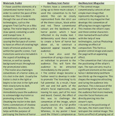
The main media product is split into three media texts, the trailer, poster and magazine. Within the trailer, consists of elements of challenging the conventions of a horror trailer and will form specific tones in different scenes. The poster is the strongest media text that needs a strong central image, since it is one the main conventions. This made it the prime element to develop or challenge. Similarly, the central image also plays a significant role on a front cover, especially when promoting a film. Ultimately, when using, developing and challenging forms and conventions of the real media products, new technologies were the main culprits in helping me to achieve a unique and professional feel of the media texts.


Q2) How effective is the combination of your main product and ancillary texts?


From analysing my main product, the poster and the front cover of my magazine all show a clear and strong link between them. This can be visually shown from the features shown in all three texts sharing an identical theme, which also shows signs of verisimilitude. This is evident in the trailer where a hooded figure is shown to be the cause of havoc, which links with the poster which shows some of the villain’s facial features, such as his eyes that are also situated on the magazine cover, hence enhancing the connection between the media texts. As a result, this helps the effectiveness of the combination to be maintained at a high degree towards making it simple to the targeted audience that all media texts are promoting the same film.

Although the trailer relates to both of the ancillary texts, it also relates with the viral campaign which consists of the strange unrevealed figure. However on further evaluation other than the trailer, the viral campaign also links to the other ancillary tasks, especially with the poster. A subtle but noticeable similarity shows the strong relationship between the texts, evidently shown through the tagline on the poster and the intertitle. Both are deliberately the same and read ‘running is futile’, which emphasises there is no hope and explores the aspects of the horror genre. The strong combination between these two media texts is further enhanced through the use of applying the same typeface and colour of the phrase. This ultimately creates an appeal, not only with the viral campaign and poster but with all media components that promote ‘The Vanishing’ towards the audience.


Q3) What have you learned from your audience feedback?


Q4) How did you use media technologies in the construction and research, planning and evaluation stages?


Tuesday, 19 April 2011

My Viral Campaign Video


My viral campaign video above was further altered in Final Cut Pro. In further detail, i have included the effect of a 'swipe' between the the hooded figure moving, when closest to the camera and then swipes away to show the intertitle, 'Running is futile'. I also extended the background music across the extended scene to not loose the spooky atmosphere and tp create an uneasy tone toward the audience. The hooded figure's face is never shown to add more focuss to create an engima.


However, on further and in depth evaluation, I have deliberatley left out the title of the film in which this viral campagin is promoting. This was the main idea to keep the level of mystery alive, expressing the conventional state of a viral campign. Also, my idea was to deliver the viral campaign six months to a year before the actual release of the film to the audience, giving the audience a lack of information and keeping the suspence at a high level. This will also have an effect becuase the date is the only element shown which provides the audience with that somthing 'big' and important that is going to be reveiled on that specifc date. Ultimately this will create a series of questions in the audience's mind showing true signs of cause and effect of a viral campign video.

Monday, 18 April 2011

Draft of My Viral Campaign


Here is my draft of my viral campaign video. Final Cut Pro has allowed me to construct and edit the viral footage, shot by myself which included the assistence of one of my group members.

Sunday, 17 April 2011

Viral Campaign Print Screens

Below are three print screens, showing the construction of my viral campaign video in three stages on the program Final Cut Pro.


Above is the first print screen, showing background of the viral video. The graphical representation of the edit below the image of the tree is shown as rows shows the layers of the tree and mist.


The second print screen above shows more layers below image containing the hooded figure appearing with an intense glow around him. This will enhamce the deliberate engimatic feel causing the audience to relate to an eerie atmosphere, which reflects the horror genre.


Above is the thrid print screen. This is showing the cloaked charcter moving closer towards the screen but in a differnt postion.

Saturday, 16 April 2011

Equipement

The equipment to help construct the viral campaign video are a:


1) SONY Carl Zeiss video recorder

2) Sherpa tripod

3) SONY Premium digital video cassette


All these types of equipment were also used for other purposes, such as the construction of the trailer. A digital camera was also required in order to take snap shots, such as for the photo shoot.


Along with these three main pieces of equipment and the digital camera were different programs that also helped me to create my media texts.

Programs, such as Paint, Microsoft Word, Internet explorer and Photoshop. These different computer programs were used in order to provide a high level of detail and accuracy, especially the Photoshop when dealing with central images.

Friday, 15 April 2011

Viral Campaign Research

Viral campaigning is a term that shapes meaning in using mystery to market movies. A great example of this is the film ‘Cloverfield’ has had a lot of attention when first appearing virally. This viral ad shows strong signs of expressing elements of being a viral campaign, as there is no title of film that is being promoted but only a release date, ‘in theaters 01.18.08’(American). This technique of providing the audience with a lack of information helps to develop the level of mystery, thus causing an enigmatic response throughout film viewers’ minds. The level of secrecy is one again carried out as a potent theme as the movie is not called ‘Cloverfield’ but presented as ‘codenamed: Cloverfield’, which explores viral marketing to its initial capacity.

Another piece of evidence of viral marketing is presented in the film ‘The Blair Witch Project’. This occurred in 1999, which was a film made by the production budget of $60, 000 and grossed $240,000,000 and overall was a movie defined viral marketing. A couple of years later Steven Spielberg explored more into going viral where he used web games to promote AI (Artificial Intelligence). This then followed 1million people visiting the film’s personal website. The website contains a series of clues and puzzles to solve that could ultimately lead to the teaser trailer or even something big and newly released to the fans that the fans themselves can cover. ‘The Dark Knight’ is another example of attaining a viral website. On closer inspection, the website shows the unveiling of who the joker is in stages where ‘Heath Ledger’ face does appear. However, this was only used once the full trailer was shown but nonetheless, the idea of this viral website does promote the film in a relatively high manner.

On the whole I think going viral is a great strategy and proves viral marketing works best for the sci-fi and horror genres, as fans for these genres are definitely more rabid.

Alternative advertising methods were needed if Cloverfield was going to attract the attention of the group of people who could be used to make this film a success in the cinema. A specialized online and computer-savy audience was specifically targeted as their interaction with the marketing was vital in the film generating interest from another valuable audience group, the mainstream movie-goer. The story of Cloverfield’s marketing shows how the online audience was used to create a buzz about the film to support a more traditional marketing campaign.

Link to Cloverfield viral video:
http://www.youtube.com/watch?v=IvNkGm8mxiM

Sunday, 10 April 2011

Personal Blog Entry

Today I have ventured out thoughts and ideas of creating a viral campaign. I have researched different viral campaign videos, such as 'The Dark Knight' and 'Cloverfield' to study the conventions and main features of the video. Therefore, I can look at challlenging and maintaining the conventions in my own viral campaign video.

I have also watched a programme on channel 4 called 'Rude Tube: viral ads'. This was an unusual experience as linking the humerous videos to promoting individuals and how they act on certain things. However, from this programme I have gained that society have produced videos acknowleging thier talents or the products which they have made. For instance, the idea of walking on water is a fantastic thought and dream but with advanced and new technolgies being made, a group of four men were promoting their product on 'Youtube' which is a huge media platform to promote your viral campaign.

Overall, I will create a viral campaign, promoting my film and putting it on my personal blog and on 'Youtube'.

Saturday, 9 April 2011

Final Magazine Cover


The image above is my final magazine. It consists of the masthead, reading 'Movie Mania' which shapes meaning appealing to the audience from the alliteration with the two 'M's. Also the word 'Movie' is written inside the word 'Mania', which adds a level of professionalism towards the product and the audience.

The media language is plays a significant part in attracting the audience. The button includes a freebie that reads 'Free CD' and 'this months biggest blockbuster'. Both of these phrases help seek the audiences' attention.

The main colours of the magazine is white, black and red. These colours are all forms and conventions of the horror genre. These colours were deliberately selected to design the magazine to create a stronger link between all the media texts, such as the poster and trailer, also including the viral campaign. Since, all these colours are situated in all media texts, this will cause an appealing perspective towards the audience and will benefit the process of promoting the film.

Friday, 8 April 2011

Magazine Prints Screens


This first print screen shows another initial image as opposed to the mock up. I had decided that to add to the level of professionalism, I made the link between the magazine and poster even easier towards the audience by using the same styled eyes.

Here I have added the central image, cover line and the masthead, all main conventions of the film magazine. I wanted to create the idea of the villain to be looking upon three individuals, connoting a tense and uneasy atmosphere.

Above is my third print screen of the construction of my film magazine. On closer inspection I have included a small background of leaves and trees to cover the white space. Skyline and a kicker line have also been added to lure in the audience.

Wednesday, 6 April 2011

Magazine Mock Ups


Above is my basic mock up of my film magazine. It involves my central image and the positioning of the cover line. In further detail, 'The Vanishing' is the film in which the magazine is promoting and is purposely laid three quarters down the page in order to become noticed and add an appealing feel towards the audience.


From this mock up, I have added a kicker, 'biggest movie of the year'. This media language, focusing on 'biggest' connotes a level of communication the audience, making the magazine stand out.
In addition, another sign of word play and media language is using a freebie. On closer inspection, presenting a button telling the target audience that their receiving something free. This will rekindle their thoughts on purchasing the magazine and will increase the chances of the product being sold.

Tuesday, 5 April 2011

Magazine Flatplans

Above is my first flatplan for my magazine. It consists of the main codes of the a film magazine, the masthead, the main image, cover line and the barcode. These were all my initial positions of where these specific elements were going to be positioned.

Here is my 2nd flatplan, showing a change in my thinking of creating some sort of text situated at the bottom of the magazine.

This flatplan introduces a skyline and a button, which also includes a barcode as well as the issue number. I deliberately added in these additional components to recall the codes and conventions of a film magazine.

Thursday, 3 March 2011

Colour Scheme

The colour scheme for my magazine will consist of the conventional number of three main colours. White and black will be another convention of the horror genre, defining the elements of good against evil and will therefore reflect the horror genre, relating to ‘The Vanishing’. These basic connotations will balance out the magazine, as these colours will cause other components presented on the front cover to stand out and sub consciously call out to the audience. This will be further enhanced with the third colour being a red, yellow or blue, mainly another colour that attains a bright and vibrant characteristic, which will personify the magazine with life, thus attracting the target audience.

Although these three conventional colours are highlighting the main features on the cover, such as the text including the masthead and slogans, other colours can be withdrawn by the audience from the central image. The central image will be three students, dressed in their normal clothes, such as colorful t-shirts and blue/black jeans. The image will also attain one character holding a blue bag over his shoulder, emphasising the theme of a journey and expressing elements of an adventure. This will provide a subtle and unknowing display of the magazine with movement within the three characters presented on the front cover, thus stretching the dynamic nature of the magazine.

Overall, my film magazine will consist of three main colours but will complement the colours of the clothing of the three individuals, mirroring an 18 year olds dress sense. In order for me to achieve this will look back at my colour wheel, labeled under colour scheme to identify what colours work well with each other.

Wednesday, 2 March 2011

Tuesday, 1 March 2011

Ideas : Buttons, Hooks and Teasers

Hooks, teasers and buttons are a variety of techniques that are required to draw the attention of the audience. Buttons are greatly used for this specific motive, since they are usually brightly coloured and have short statements or facts on what the magazine can offer the reader.
Examples of hooks, teasers and buttons that I am going to consider for my film magazine:

• Win a trip to London for the premier of ‘Harry Potter and the Deathly Hallows’
• The return of Peter Jackson
• Win the competition and travel to New York
• Plus interviews with Jonny Deep and Sharon Stone

All of these hooks, teasers and buttons ideas help draw the audience in and are a very useful technique of attracting viewers in purchasing the magazine. For example, I would use free posters, free posters or a free CD. This will advertise the film magazine to the audience and would sell to the target market, which would increase, causing institutions to gain the maximum revenue.

Monday, 28 February 2011

Masthead Graph


Above the results for my possible masthead choices. From questionning 15 people, aged bewteen 13-45, I have attained results showing their responces of the three mastheads.

Evaluating the graph, eight individuals selected Movie Mania as a possible masthead. Five chose Epic Film and a minimum of two people liked Film Nation.This clearly shows Movie Mania as favourite, which I personally admired as opposed to the rest. Overall, I think this is the best possible masthead, as it consists of clear and direct meaning, making it easier for the audience to acknowledge attracting a vast target audince. As a result, I will use this masthead for my magzine because of the positive feedback I received.

Sunday, 27 February 2011

Ideas for Mastheads

The mastheads for my magazine should attain a conventional meaning relating to the film industry, thus making sure I use words and phrases that are easily understood by the audience.

• Epic Film
• Movie Mania
• Film Nation

'Epic Film’ plays on key aspects in standing out to the audience. I wanted to create a huge deal of film, targeting film fanatics who can relate to the masthead. Furthermore, the ‘epic’ wordplay is vital for the success of portraying the magazine to be highly considered in purchasing. The two words also include one syllable attaining an easy and quick appeal towards the audience.

‘Movie Mania’ is a highly strong contender to becoming my film magazine name. It is straight to the point, direct and provides the audience with an easy relationship with the film magazine. This is because of the deliberate media word play, ‘Movie Mania’ harping on the technical device, alliteration. The two ‘M’s at the beginning of both words cause a sub-conscious appeal towards the audience and therefore attaining a more attractive element compared to other magazines. In further detail, the word ‘Movie’ is a simple meaning, telling exactly what the magazine is about, which is emphasised from ‘Mania’. The reason for this, ‘Mania’ connotes a large and ‘grandest stage’ perspective, thus suggesting the magazine is shouting to the target audience and becoming noticed. As a result this masthead will be considered for the name of my magazine.

The third masthead, ‘Film Nation’ is a basic meaning representing all aspects of film. This will present the audience with a greater understanding of what the magazine is all about. However, this specific masthead appears to have an older audience. This is clearly evident as most people in society are adults, exploring that key word in the masthead, ‘Nation’, which applies to a general audience.

Saturday, 26 February 2011

Magazine Frot Cover Analysis


This is a prezi containing my research about film magazines that i have analysed to help me create a profesional film magzine and to develop my understanding of their conventions.

Friday, 25 February 2011

Introduction: Magazine Task

The third part of my task is to design a front cover for a film magazine featuring our film. To create my individual magazine front cover I will be using the photographs used in my film shoot. However, if I come up with other ideas that require different types of shots I will have to take new photographs that can be applied to my magazine. In order to complete this task, similarly I will have to research and analyse different magazines. I also need to design flat plans for my magazine to bring out the best construction for my magazine task, which will be developed and annotated to produce my final magazine cover attaining further elements of professionalism.

Wednesday, 23 February 2011

Final Piece:Poster


The final design for my poster includes other components, such as the production logo, AROA and other logos, like 'Dolby Digital' and 'Vertigo'. Also, the red cross is included in the centre of the poster, causing structure in the word of the tagline. This can connote a religious concept that is also a conventional element of the horror genre. Additionally, there is an icon on the villain's forehead. This icon gives the villain a sense of character and purpose. It also provides the killer with a mysterious and different background to other characters and the audience. This will have an effect of causing the audience too see that the villain has his own aura, thus showing he is a distinctive individual.

Saturday, 19 February 2011

4 Poster Printscreen


The film poster credits at the bottom of the poster are in a white ariel typeface. The credits are also a conventional aspect of a poster that include the producer, director and other significant jobs made for the film. My production logo and other logos will also be located around the credits to create a more professional feel towards the audience.

Friday, 18 February 2011

3 Poster Printscreen


The title, 'The Vanishing' consists of 'Face your fears' typeface is in red and obtains a drop shadow to create an effect of depth and jumping out of the page, sub-consciously 'shouting out at the audience to become noticed. 'Running is futile' is the fixed tagline used for the purpose of the media language. This is upon the killer's nose, subtly covering the villain's face, thus empahasising the enigmatic tone towards the audience. The three actors are also used, also coming from the 'rule of three', are there to attract the target audience and to make the poster appealing to the eye.

Tuesday, 15 February 2011

2 Poster Printscreen


In this printscreen I have alternated the eyes by using another photograph that I took, which involves a more sinister pair of eyes that hold a more piercing attitude. This will have an effect of luring the target audience to view the poster in more detail due to the connection between the villain and the viewer. This was a huge part of the poster, as the eyes provide the poster with life.

Sunday, 13 February 2011

1Poster Printscreen


This printscreen consists of only the 1st draft of the central image. Around the chin area of the villain also includes a white mist which grazes along the poster. In this image the eyes are lazy and rigid which need to be more lively.

Friday, 11 February 2011

3 Poster Mock Up


The third poster mock up is not completed to full but provided me with a good and respectable idea of what my poster will look like. Focusing on the mock up above, consists of the title, central image, an example of a tagline and three actors names.

I have decided that the title is going to be positioned in the bottom third of this media text. The mock up contains a thick, bold ariel black typeface but for my final poster I have also explored other typefaces, such as 'Acid label' but a stronger font will be 'Face your fears'. This mock up contains an unconventional red background. This is because in photoshop the preview of the central image was in red. However, on looking back at the poster a stronger perception of a conventional horror will contain a black background with a red title. These colours will compliment each other and will produce my aim of constructing a conventional poster.

Similarly, the tagline reads 'there's no escape', expressing elements of fear relating to the horror theme. However, the second mock up contains a tagline 'Running is futile', which on the whole feels more attractive. This evident from the media language becoming more 'adult' in contrast to a simple direct meaning. 'Running is futile' will be highly considered due to its higher level of attracting the older generation, aged between 30-45 opposed to 20 year olds. The tagline is also in a sharp and thin font which was purposely designed to connote and relate to a sinister and 'knife' like structure, linking to the horror concept.

Above all, the central image is the most potent element on the poster. The idea behind the central image is a deliberate motive of hiding the villain's facial features. Simply because it creates an enigma, thus enhancing the involvement between the poster and the audience. In further detail, the central image only consists of his eyes, a part of his nose and his beard. The nose and beard are partly there to give the poster and figure some depth and volume. However, the eyes and eye brows are the main source of facial expressions, as the eyes can show how a person feels and motives. On closer inspection, the eyes appear to be still and lifeless. Due to this issue, I will use my experimental eyes of the killers to provide the poster with, yet agin more depth and emotion. Ultimately, this will involve the target audience far more since the villain will appear to be looking at the reader in an intense manner.

At the top of the poster are the three actors, 'Steve Hawk', 'Frank Jones' and 'Andy Maynard', which will engage and attract fans of these actors to watch the film. Three names are also laid on the poster to fill the poster with components relating to the film and to give a sense of direction towards the audience to have a starting place to read from.

Thursday, 10 February 2011

2 Poster Mock Up


The 2nd mock involves two film actors situated at the bottom third of the poster in thick bold typeface. This white typeface will also stand out, as they covered above the image, that includes the black cloak and the brown skin tone.

The tagline is another significant component which empahasises the conventional feel of the poster. 'Running is futile' is in thin black typeface laid upon the villain's forehead. This gives the audience a direct relationship between the tagline and the killer. In further detail, the tagline shapes meaning as the media language consists of sophistication and a sense of professionalism, focusing on the word 'futile'.

'The vanishing' is located at the top of the poster, shown in a degraded font, 'acid label'. This connotes a serious, tense and death like tone, which creates a horrific theme of pain and agony that reflects the horror concept.

Overall, the main colours used are black, white and red. These three conventional colours of a horror poster compliment each other and will add to creating the poster to become appealing towards the target audience.

Wednesday, 9 February 2011

1 Poster Mock Up


The above image is one of my initial mock ups for my poster. Although, this mock up is fairly basic, it consist of the title, 'THE VANISHING', which is positioned roughly three quarters down the page. The reasoning is because I wanted to make the title the base of the poster, as if the title was holding up all the significant elements above it on the poster. I further evaluated this reasoning by applying red as the colour of the title. This conventional red is a relatively bold and strong shade, that connotes a series of horror aspects, such as aggression and blood. This further suggests key characteristics of the villain, suggesting he obtains the cause of death and suffering, since he is a superior figure on the poster.

The two film star names are also positioned at the top of the poster. This conventional positioning helps the layout of the poster to become more appealing to the eye. This information given to the audience can lure in them to see the film, as individuals who have seen films that they have liked with these actors will be more willing to come and see 'The vanishing'.

Sunday, 6 February 2011

Poster Flat Plans


The flat plan above shows a greater look into my final design for my magazine. Here I have introduced a photograph of the villain, deliberately using only part of his profile. This adds to the enigmatic effect created by the close up mid shot which is emphasised from the black hod connoting a dark and sinister film and reflects the horror genre.
Along side the central image are the title, two taglines and the text at the bottom of the poster. This divides the poster in two halves and presents the poster in a clear way to invite audiences to acknowledge it.


This is a simpler flat plan but more effective as opposed to the first one. The reason for this is because it consists of having a clearer layout, thus creating a reader friendly appeal and therefore attracting more people to watch he film. The main feature on the poster, the central image, tagline, title and text are positioned down the middle of this media platform. This provides the poster with an act of professionalism and portrays a theme of continuity.


Here is a basic flat plan for my poster. I have deliberately placed the title of the poster at the top of the poster because my intention is to make the title on of the first elements to be identified by the audience. Below is the central image that I positioned in the middle of the poster. From my research, I have encountered many posters that attain images in the center of the layout, therefore I too positioned my central image in the middle. This has an effect of attracting the target audience, as the majority of people look at the large image first, as from my research I have found that audiences look two thirds up the page from their first glance at the poster, specifically the image.

Saturday, 5 February 2011

Further Photoshop experiments

This photograph was used for experimenting on, since I labeled it as an image that can be considered for my magazine and poster. In further analysis, I chose this image because it has a superior feel of horror, mainly arising from the black hood and blank expression. However, to enhance this image I will have to apply some effects and alternate it in Photoshop.


Below is a developed image of my initial photograph. Here I used red as it reflects off the white background. However, on closer inspection I will probably not use this effect or image as it shows a weak connotation of horror, which will result in further experimenting.


I then tried only focus on the figure's face by highlighting his face in white, standing out from the alternated red cloak.


The filter of liquidised is used to create a different perspective of the image. This is water like effect was just to see what the image would look like. Although, this effect does not have strong sense of horror, by experimenting with this effect can be used for a different element in the poster or magazine, as it provide a unique touch.


Another red effect is used but on a closer look this is very similar to previous developments. This is because I am slowly inching towards an idea of the individual posing as the killer where he is only shown in a distinctive manner from hiding the villain's features from the audience. Above all, this can contribute towards an enigma being formed, having an effect of engaging the audience and adding an element of mystery linking to the horror and supernatural genre.


Below is the experiment of my initial image but consists of a very different approach compared to the other developments above. On greater accuracy on the image , I slowly began to consider other colours to create a unique and unconventional effect.


A further development of using different sources of 'light' can convey a different meaning. However, focusing on the photoshop image below, I will use all of the image as it does not contain a strong focus on a horror genre. On the other hand, I will strongly consider using some of the image, such as the villain's eyes that are a unique and abstract colour of yellow, connoting an aspect of something obtaining a predator like instincts. This tone of death will be further enforced from the hot red and oranges in the image, thus creating a tense feel.


These two images consist of the filter of Neon lighting that is used to create a different style of photograph. This is emphasised from the black background adding to the glow effect of the villain, which suggests a supernatural but mysterious feel, thus contributing to the element of uncertainty and above all fear.


Above is a developed experiment of the initial photo. Here I have kept the red preview colour as it compliments with the white, balancing the connotations of rage and anger with tranquility and purity. In further detail, I have also deliberately hidden the features of the villain to create an enigmatic tone. This will create questions through the target audience, also mirroring the horror genre from expressing signs of hidden and undiscovered elements. Ultimately, this style and idea will be strongly researched into as I do admire the effect it emits.


Friday, 4 February 2011

Photoshop experiments

Photoshop is a very useful and powerful program, where I can experiment with different photographs with alternative effects by using selective filters. However, when I decided what effects to experiment towards my two media texts, I made sure I did not choose a random filter. I carefully looked through all of the designs and selected the ones where I can relate them to the horror genre. Although, a careful selection is needed I too did experiment with a variety of effects which conveyed different impacts, expressing and improving my creativity.

Here are some experiments I produced on photoshop.
From my research I identified that posters and magazines consist of images having a significant impact, resulting from several reasons but mainly focusing of the facial expressions of a figure. This follows one of my initial photographs of a pair of eyes, showing a great deal of character and emotion. This is clearly shown from the shape of the eye brows expressing a mean, uneasy and aggressive connotation, which all reflect the horror theme.


I then opened this image on photoshop to enhance the creative flare of the photograph. In this picture below, I used a common 'adjustment', involving changing the lighting and above all, the contrast of the image. To be more exact, when applying this effect, it produced the initial black colours to become more enhanced and darker. This personified the eye brows to become a greater element in the image, especially when they began to cover the eyes of the individual. This will create a further suspicion between the audience and the photo because the eyes are slightly hidden, which makes the audience want to look further into the image, having a purpose of looking deeper into the pair of eyes.


A further experiment was then formed by using a stamp filter to create a different and unconventional theme facial expressions. Although, this is an experiment I realised that this technique is not clear enough to be situated on a front cover on a magazine or on a poster. However, red was the colour applied as it was used in the preview, which I thought worked and portrayed a convention aspect of blood, hostility and shows signs of arising from a horror background.


Thursday, 3 February 2011

Photographs


I have put my photographs in a video format to add to my creativity. I created this video in Final Cut Pro, which highlighted my skill of assembling my video with a tense soundtrack of music to reflect to a horror genre. These shots are explained in the shooting schedule table.
In this video, there are six particular photos that contain some shots that may not be necessarily going to be used but have inspired an idea in me in my thought towards creating my poster and magazine. However, some shots are favoured and will be highly considered, if not for my poster or magazine, they will ass to my research and will come in use when playing with programs, such as Photoshop and Final Cut Pro to enhance my creative attributes.

Tuesday, 1 February 2011

Photography Planning


The photographs for my poster and magazine were initially going to be used from the filming. However, these photos were too dark and did not meet to the standard of a central image of the poster, which should be sharp,in focus and sustained at a high quality shot. Therefore, I will have to use my digital camera to take new photographs that I can use on my magazine but for now on my poster. I will also make use of the flash on my camera or flash lights, along with a torch if a shot requires it to give a different effect.

Friday, 21 January 2011


Above is my production logo. I altered it becuase I wanted it to have a new original beginning being involved with the poster. This conventional code will positioned on the poster showing who produced the film and poster. The alteration is purposely done because I wanted to make the 'AROA' stand out, thus replacing the balck bold lettering with white text laid on the balck camera, standing out.
However, this may not be the finished logo for my poster, as the balck background for my poster will not really reflect my production logo, focusing on the black camera.On the other hand, I could place the logo on a small white background on a black canvas causing the production logo to stand out. I may also, just only use the white initals placed in the corner, reflecting into the audience perspective against the balck background.

Thursday, 20 January 2011

Personal Blog Entry

Today, the group, created the team production logo. We used the program of paint to complete this task, where we all came up with suffecient ideas that were evaluated and presented in a professional way. In the end we arrived at a final design which was comfimed with all group memebers and created a stronger team bond, mirroring media institutions, thus exploring the versilmilitude of the media world in today's cociety.

Wednesday, 19 January 2011

Colour Schemes

Colours are a major feature of a poster as they show great relevance and connote a variety of meanings. For instance, the colours on a particular poster and tell the audience what the genre the poster is coming from. For example, black can connote a series of emotions, such as love, passion and desire. However, it can also symbolise signs of aggression, hatred and blood, which has a further connotation of death.

In order to create my poster, I will use the program called Photoshop that will allow me to enhance my poster with effects, above all making sure it links to the horror genre. In addition, I also want to obtain a connection between my poster and the previous task, my trailer. This will create a sense of ‘thinking ahead and attain a high aspect of professionalism. This too will help the target audience to identify what specific genre my poster is reflecting by remembering the trailer and increasing the audiences’ interest level.

According to my analysis and research, colours serve a visual aid and will cause the audience to be highly attracted to my poster or not. In order to have the full attention of the viewer I will edge toward constructing my poster in a conventional manner. This will make my poster more appealing as it is easier from the audience POV what genre the poster is advertising. As a result, my genre is horror, therefore staying on a conventional path my poster will consist of three main colours, red, black and white.

In more detail, these conventional colours work extremely well together according to my research. This is because they all connote different connotations and when printed on the same media text assist one another and balance the perception exposed to the audience. To pin point this statement, the connotation of red in a horror sense will represent the idea of blood and enhance the level of death and violence. However, although red is a bold and rich meaningful colour, the shade of black also goes well with this as it too symbolises elements of horror. These features will be the connotation of the colour being isolated and darkness, which both contribute and emphasis the connotations of the elements of the poster that are red. The horror genre is re-enhanced from yet another but different connotation of black. This colour is used is a conventional horror state as the background of poster, which represents huge signs of ambiguity and reveals components of forming an enigma and suspense toward the audience and ultimately adding to the potent theme of mystery. Red and black are strong masculine colours, which is why the colour white is introduced. This conventional colour combines the three colours all together as it is a colour that stands out on a conventional black foreground colour. The white can also relate to horror but from a different angle, as it connotes a calm and tranquil tone and therefore balancing the colors on the poster. This is because the purity of white allows the colours to pivot equally, as it situated mainly on the darkness of black and then ties in with brightness of red. Overall, this makes the poster eye-catching and attractive to the audience.


This is also evident from the colour wheel and to enhance my research I have looked into a colour wheel, as to see how close the colours, red, black and white are to each other. I will also look at what other colours work best that complement each other and can be used simultaneously from the purpose of the colour wheel to increase audience viewing.

Monday, 17 January 2011


This is a pie chart showing my results of what people's favourite choice of tagline isout of the tree options. Out of 12 people, 7 people liked 'don't bother running, it will only find you'. However, only 1 person liked 'escape is inevitable' and 4 individuals are admireres of 'running is futile'. On the whole, 'don't bother running, it will only find you' is clear favourite and will be a major contender or the tagline that will be required on the poster.

Sunday, 16 January 2011

Poster Taglines

Taglines are also a feature on a film poster. They usually consist being made of a short statement that possesses an indirect meaning and leaving the audience to ponder the enigmatic tagline.

Here are a few of my examples that will be considered in my poster:

‘Don’t bother running...
...it will only find you...’


This tagline is a personal contender for my poster. I think it has a huge potential meaning that cause an enigma. This is evident because of the word media language the statement possesses. ‘Don’t bother running’ is a short simple response which will direct the audience to quickly browse over it but will then be brought to the attention of the words that follow it. ‘It will only find you’ conveys a hidden meaning and quickly brings the aspect of horror to the surface of the viewers’ thoughts. In further detail, I have deliberately used the word ‘it’, which will again play on the audiences’ mind and question them who or what will find you. Also the second person narrative also involves the audience in a subtle way. This can be shown from the use of language, focusing on the word ‘you’, which implies that the poster is communicating with the audience. This has a knock on effect causing a bigger impact on the reader of the poster and will lure the audience even further.

‘Escape is inevitable...’

This is my least favourite possibility of the title. Although, this tagline has a meaning, I find it too simple and not up to a high standard of professionalism. This statement can be seen on any film poster which involves a significant chase scene. However, this punchy and quick tagline does have its benefits, that being it portrays the poster to be far more concise and less wordy. This too can help lure in the audience to watch the film and to read the entire poster.

‘Running is futile...’

‘Running is futile’ is a sentence that adds to the sophistication of the film. To pin point this high class fashion, the word ‘futile’ shows a sense of uniqueness to the poster itself. The reason for this is because the central image and title can look childish but when actually reading the tagline, it too can make the target audience think and want to know what that word means. Yet again, a domino effect is created as the audiences wonder what that word means and research it; they will begin to look into the film and is a tactic to enhance the audiences' interest.

Overall, although a tagline appears to be small in size on the poster and will be over powered by the central image and the title, they can still prove beneficial when attracting different types of audience. For example, lengthy unknowing words to some individuals will appeal to audiences who are more experienced and older. Whereas, a central image or a short, quick statement will attract the younger individuals, such as young adults.

Tuesday, 11 January 2011

Poster Typefaces


This prezi covers the typefaces for the title of the poster and the slogan typeface. However, the typeface design for the actual text itself, will be a normal clear standard style making it veryeasy to read.

Thursday, 6 January 2011

Wednesday, 5 January 2011

Introduction: Film Poster

Following the main task of producing a ‘teaser’ film trailer, creating a film poster was the next assignment also reflecting against the horror genre. The poster should also link with my trailer and have a connection to maintain a high amount of communication with the audiences advertising my film from media platforms, such as my film trailer, a poster and a magazine cover. This will maximize consumption and increase profits from these different types of media.

In order to construct my poster, I will do further research on film posters by analysing the codes and conventions to improve my understanding and knowledge of what significant elements I need to incorporate. I will then begin to design flat plans, which will include images that I will be taking from my digital camera, as the main image can be the major convention to interest the audiences and provide the poster with character. Afterwards, I will try and piece the best flat plan and photograph and design my film poster on Photoshop to create a more professional approach.